
Red ita bags make the strongest single-color statement of any display, but that intensity means every choice — the insert shade, the merch layout, and any exterior accents — needs to earn its place.
Choose the Right Look
Red works best when used with clear intent. Bright scarlet suits anime hero and villain builds where red is part of the character’s design. Burgundy and wine tones support vintage, gothic-cute, and more restrained aesthetics. True red paired with black hardware is the strongest idol display formula when the concept demands a bold, saturated frame.
Start by laying out your merchandise before choosing the bag color. If your pins and charms already use red as an accent, a neutral bag may serve the display better than a red one. If red is the theme itself — a red-dominant character, a villain-coded fandom, or a specific idol group concept — the red bag becomes an intentional frame rather than a competing element.
Color and Styling Pairing Guide
| Bag shade | Pair with | Best mood |
|---|---|---|
| Bright scarlet | Black, white, gold | Anime hero or villain |
| Burgundy / wine | Cream, antique gold, brown | Vintage and gothic-cute |
| True red | Black and silver hardware | Bold idol statement |
| Red and black | White or pale pink accents | Gothic-kawaii contrast |
Display Concepts That Work
- Concept 1: A bright red convertible bag with a black removable insert — pins and badges appear sharp against the dark background while the outer bag provides all the color impact.
- Concept 2: A red heart-shaped bag used as a single-character shrine with one large centered piece and two smaller flanking charms, keeping the heart silhouette visible from a distance.
- Concept 3: A kawaii-style red bag with a cream or white insert for a warm contrast that avoids the visual heaviness of all-dark materials.
Test the concept on a paper template before attaching pins. Leave a visible border around the display and keep faces, logos, and text positioned well away from any curved window edges where glare can obscure details.
Choose the Depth of Red That Fits Your Theme
True red dominates every scene it enters. When the bag is red and the merchandise contains significant amounts of white and black, the contrast works well and each piece reads clearly through the window. When the merchandise is also heavily red, outlines blur and even valuable individual pieces can disappear into the background. Adding a black or cream insert restores the definition that a single-shade display loses.
Burgundy handles photography more forgivingly than bright red. Saturated reds can clip highlights in direct light and make pin holes visible on the fabric if the backing shows through. If you plan to photograph your display frequently — for posts or fandom sharing — a deeper, slightly desaturated red or a wine tone is more likely to render accurately without color correction.
For villain-coded builds, restraint reads as intentionality. A limited number of large, high-detail pieces against deep red communicates a more deliberate aesthetic than a fully loaded window. Leave breathing room between items so each piece holds visual weight on its own.
Choose the Bag by Merchandise Type
| Merchandise | Best window | Practical check |
|---|---|---|
| Enamel pins and badges | Flat window with removable insert | Use locking backs; pin holes are more visible on red fabric if the insert backing shows |
| Photocards | Shallow flat window | Keep cards sleeved; check for sleeve glare against the red background when photographed |
| Acrylic stands | Medium window with secure anchors | Transparent acrylic reads cleanly against red; test positioning before committing |
| Plushies | Deep clear window | Measure plushie thickness against the window depth before ordering the bag |
Avoid Common Problems
Red displays have specific failure modes that neutral bags avoid. Knowing them in advance saves a layout that looks strong in planning but loses impact in practice.
- Red-on-red merchandise makes individual items indistinct. Use a contrasting insert color to restore definition.
- Glossy or shiny red fabric creates glare that obscures window details in photographs. Check the material in natural light before purchasing.
- Overloading a red display adds visual noise faster than with neutral bags. Reduce the piece count and edit deliberately.
- Heavy exterior decoration on a red bag compounds the intensity. Limit exterior charms to two or three maximum.
- Measure the visible clear window opening, not the outer bag dimensions, before planning your layout.
Shop the Look
Current red ita bags in stock: the Red Kawaii Convertible Ita Bag ($63.54) works for pins and small accessories with its flat clear window, and the Small Red Heart Convertible Ita Bag ($66.55) is suited to a focused single-character display where the heart silhouette is part of the build concept.
Browse all ita bags for the full range, compare window sizing and insert options in the ita bag size guide, and check the ita bag accessories guide before adding exterior decoration to a bold-color build.
Shop Popular Ita Bags
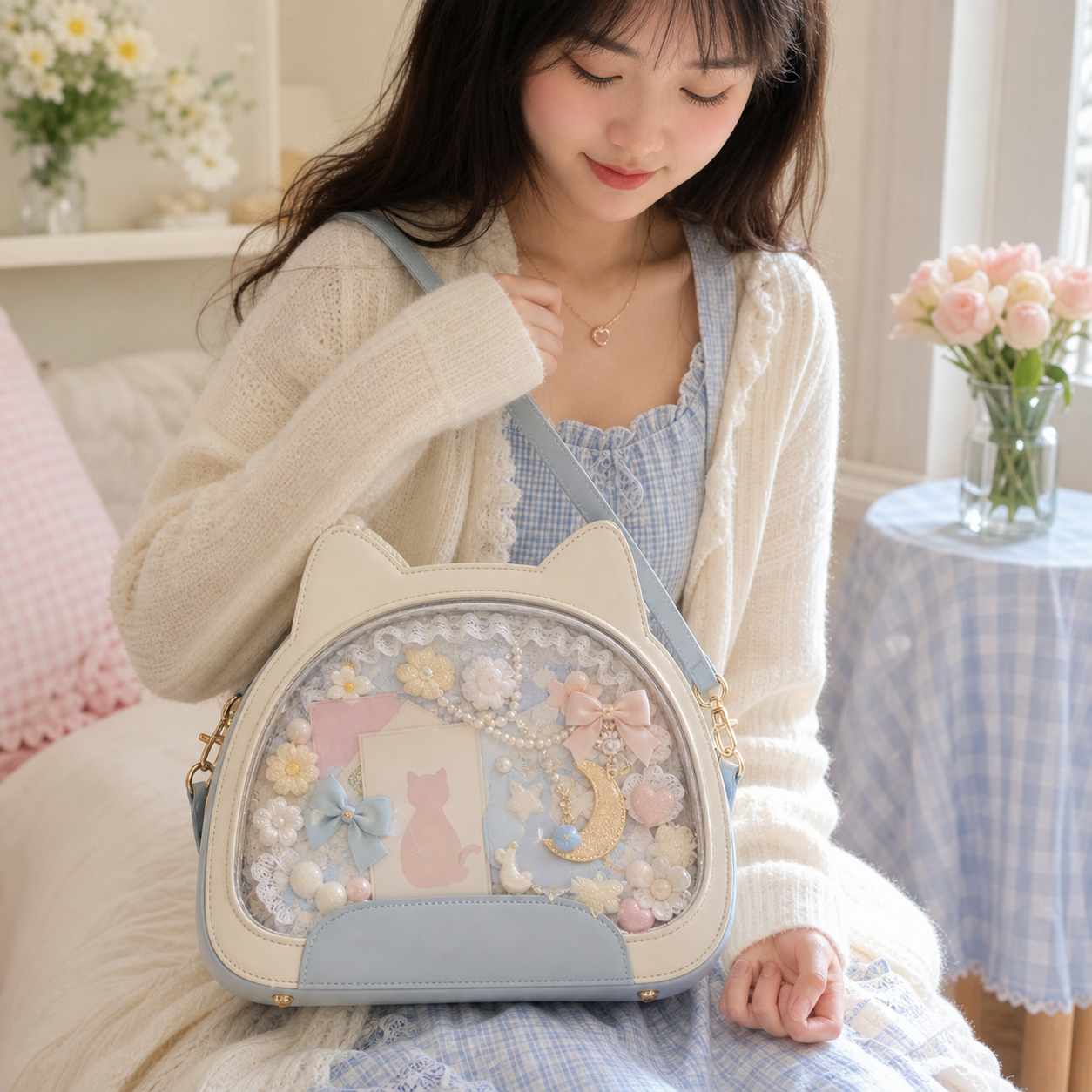
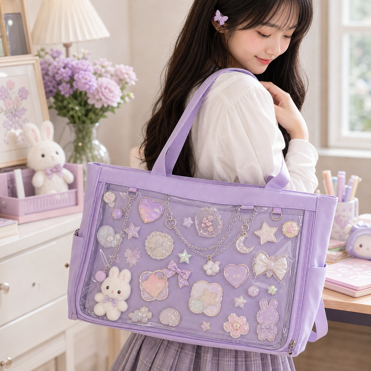
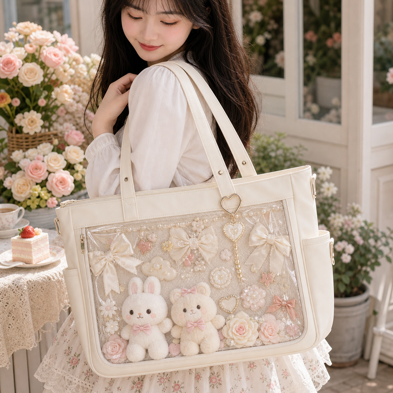
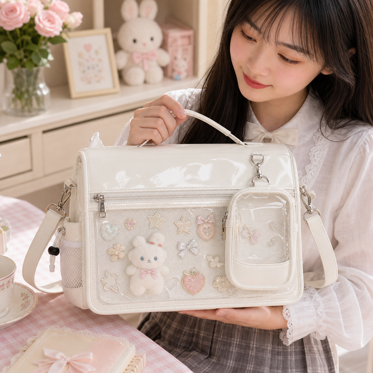
Clear window styles, mini crossbodies, convention backpacks, and starter kits — the most popular picks from YourItBag.
Frequently Asked Questions
Are there red ita bags available to order?
Yes. Two red ita bags are currently in stock: the Red Kawaii Convertible Ita Bag for Pin Display and the Small Red Heart Convertible Ita Bag. Both are convertible styles with a clear window for displaying pins and accessories.
What merchandise works best with a red ita bag?
Black, white, gold, and silver accessories create the strongest contrast. Avoid large amounts of the same red shade in your merch collection, as similar reds blend together through the window and reduce the visual impact of individual pieces.
Can I use a red ita bag for photocards?
Yes. Sleeved photocards work well against a red background, but check that the sleeve material does not produce glare or color cast when photographed. A shallow flat window keeps cards close to the surface and easiest to read.
How do I prevent a red display from looking too busy?
Limit exterior charms to two or three, choose a contrasting insert color such as black or cream, keep the window layout clean with visible spacing between pieces, and resist filling every available pin hole.
Related Ita Bag Guides
Continue with the guide that fits the next decision in your build — whether that is comparing a different base color or refining how the display is structured.
- Black Ita Bags: Gothic, Kawaii, and Versatile Display Builds
- Pink Ita Bags: Soft Pastel, Black-and-Pink, and Idol Builds
- Goth Ita Bags
- Orange Ita Bags: Warm, Vibrant, and Autumn-Coded Display Builds
- Ita Bags by Color: Red, Pink, Black, Pastel and More
Shop next: For current options, browse ita bags and compare window size, insert support, and strap comfort before choosing your color.